


March 24, 2020
Here are some simple steps to choosing paint that will help you avoid getting the wrong color. Sometimes it’s just a matter of choosing a white paint with a hint of grey or a hint of brown. Also, keep reading because I will share some of our favorite white paint paint colors to give you a good place to begin.
Have you ever painted your walls white and had them turn out more peach, more green, or a kind of dirty looking? So frustrating.
Here you thought you couldn’t go wrong. I mean white is white, right? –Well, no. Absolutely, 100% not.
Choosing white paint for your home can be tricky because there are a lot of slight variations in white paint and a lot of things to consider: natural and artificial light, other colors in the room, and how you want the room to feel.
This side by side comparison is a perfect way to see how quickly white paint can become very different from each other. Courtesy of Sherwin Williams.
Let’s talk about how to choose the best white paint for your home and give you a list of some of our favorite white paint colors as a starting point so you can avoid costly painting mistakes and be on your way a freshly painted space.
SHOULD YOU USE THE SAME WHITE IN EVERY ROOM?
The short answer is no. Different whites look a bit different in each space depending on lighting and other colors in the room so picking the right white paint for each individual room is important to get the right feel. That said, you dont want adjoining rooms to look like the lights are flashing on and off (warm/cool/warm/cool) so you want to make sure there is intent to the rooms wall colors.
That said, you may find a white that does work in multiple areas of your home, which does make life (and touch ups) easier, for sure.
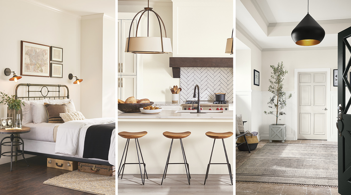
For example: In my own home I used a warm white in my kitchen I used a warm white on my cabinets because I wanted the space to feel warm and welcoming. In my new patio space, I used a cooler white because we get so much sunshine and I wanted the space to feel cool when it was 100 degrees out.
This is a great example of choosing a white based on how you want a room to feel.
WHY DO YOUR WHITE WALLS LOOK TOO YELLOW, PEACH OR GREEN?
The reason some whites end up looking like a pale shade of a color is because most white paint colors aren’t pure white. They are actually a very very light shade of a color.
To the naked eye, they look white, but if we look closely we can see they have a tiny ounce of color. That evident color is the undertone and it will show up ever so slightly once you paint your walls.
The undertone is what makes your white less stark or bright, which is a good thing. But if you get the wrong undertone it can be a disaster. Think about what you will be pairing it with: for example, if you have warm toned floors, think cherry wood, you need to make sure your white doesnt turn green or peach. If you are doing gray quartz make sure you dont end up with a pink white for your cabinets .
HOW DO YOU IDENTIFY UNDERTONES IN WHITE PAINT?
If you’re looking at a paint swatch with multiple shades on it, you’ll look at the darkest shade to see the undertone.
For example, when you look at a few white paint strips next to each other, the light shades at the top look very similar. It’s not enough to choose your color based on these shades alone.
You’ve got to look at the darkest shade on the swatch to really see the undertone or base color that those light shades are made from.
When you look at those darker shades you can see that some whites will have a yellow undertone, some a blue undertone, some a purple undertone, and some a grey undertone.
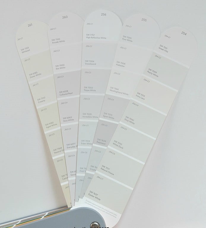
White Paint Side by Side Comparison
HOW TO CHOOSE THE RIGHT WHITE PAINT FOR WALLS
So then how do you take this information and choose the right white for your walls?
WARM OR COOL WHITES
First you need to decide if you want the white in your room to be a little bit warm or if you want a cool white.
Cool whites will be brighter and warm whites will feel a little more cozy, so it really depends on the feel you’re going for.
LIGHTING IN THE SPACE
You also need to take into consideration the lighting in the room you’re painting.
Rooms with northern exposure don’t get direct sunlight and the natural light coming in has a blue hue to it. This will enhance any whites with blue, grey, or purple undertones.
Southern exposure rooms have the most intense light and have a natural warm hue with the direct light coming in, although the light can and will shift throughout the day.
And eastern and western facing rooms will have cool light and warm light depending on the time of day.
PAINT SHEEN
For walls it’s best to go with as little sheen as possible. Flat paint will absorb the most light and give you the truest color, but they also show the most wear and smudges. So going with an eggshell or satin sheen is usually best, especially in high traffic areas or if you have kids, so you can easily wipe them clean. We usually recommend flat for a ceiling and semi gloss for trim. Wiping a ceiling is next to impossible and who wants to repaint an entire ceiling? Mean while being able to wipe dust and pet hair, vaccuum smudges and whatever that other stuff that lands on floor trim happens to be (one of life’s big mysterys) is key to your home looking fresh and clean.
HOW TO CHOOSE THE RIGHT WHITE PAINT FOR CABINETS
The same undertone rules apply for choosing white paint for cabinetry. You’ll want to decide if you want a warm or cool white and take the lighting situation into account.
You’ll also want to choose a really durable paint and go with a glossy sheen so you can easily wipe down your cabinets.
If you’re painting the walls next to your cabinets white, you don’t necessarily have to choose the same color for both the walls and the cabinets. You may want to go a shade darker or lighter for one or the other, or maybe even a little cooler or warmer for one.
Remember the color could read differently on cabinets vs. the walls because of the sheen you choose or it could be that the sun hits the wall with the cabinets differently than it does the wall.
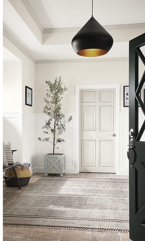
This image featured on the Sherwin Williams site is a great visual of mixing whites. Sherwin Williams Extra White 7006 paired with Gossamer Veil sw 9165 create depth and interest without adding bright color pops.
HOW TO CHOOSE THE RIGHT WHITE PAINT FOR TRIM
I’ll admit, I’m a sucker for bright white trim. I usually just buy high gloss pure white paint right off the shelf and don’t even bother looking at color swatches for trim. I love how fresh it looks and is easy to touch up. Using a bright white (unmixed) paint also means that you can find it again when you need to do touch ups. That isnt always the case so still do a quick sample in an unobvious area. Sometimes fading can happen or manufacturers can change a recipe and I would hate for your trim to be striped!
However, if your home needs a warmer white for the trim, you should go with a neutral off white and avoid too much yellow in the undertone. A neutral white will have a dark shade with some brown and/or grey in it. It won’t have a lot of orange though.
PAINT SHEEN
It’s best to do trim in a gloss. If you don’t want it to look shiny, do a semi gloss, but the shinier the easier it will be to dust and wipe down.
Remember that the glossier the paint the more reflective it is. Which means it will absorb less light and therefore absorb less of the colors around it. In fact, glossy surfaces will bounce the other colors in the room around more.
BEST WHITE PAINT COLORS
Now you’re armed with a lot of really good information about how to choose white paint colors for your home, but I know that standing in the paint aisle can be really overwhelming, so I thought I’d give you some of my favorite white paint colors as a starting point to help you choose your perfect white(s).
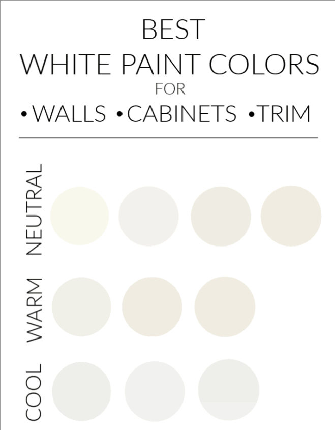
Best white paint options compared side by side. See below for the key for color names and maker.
NEUTRAL WHITE PAINT COLORS
Neutral white paint colors will take the bright starkness out of your white but they go great with both cool and warm colors so they’re really versatile and timeless.
(In order left to right)
Simply White – Benjamin Moore
Snow Fall – Behr
Swiss Coffee – Benjamin Moore
Greek Villa – Sherwin Williams
WARM WHITE PAINT COLORS
Warm white paint colors will be your least bright off whites and bring warm tones into the room. They’re a great way to make the natural blue light in northern exposure spaces feel a little bit warmer and cozier since they’ll counteract the blue.
Keep in mind though that any color looks more intense in rooms with northern exposure.
(In order left to right)
White Dove – Benjamin Moore
Alabaster – Sherwin Williams
Swiss Coffee – Behr
COOL WHITE PAINT COLORS
Cool whites will be the brightest and have the most crisp feeling. The blue undertones are a little brighter than cool whites with grey undertones. Blue absorbs red so if you’re trying to counteract too much warm light coming in, choosing a white with a slight blue/grey undertone will tone down the red hue of the light.
(In order from left to right)
Extra White – Sherwin Williams
White On White – Glidden
White Diamond – Benjamin Moore
ONE MORE TIP…
Paint companies seem to be moving away from providing swatches with the different shades of the color on the same swatch, which makes identifying the undertones more difficult, especially if you’re new at this.
One way you can still identify the undertone is to look at the color swatches around the color you’re looking for. In other words look at the entire wall of paint samples as a swatch. They usually go from light at the top, to dark at the bottom and those dark shades will have your undertone.
They’ll also go from cool to warm as you move from side to side.
I do think that looking at the swatches like I’ve shown here in my photos is the best way to go because you can see them in your own home and get a good feel for how they’ll read with the lighting you have. Of course the swatches are just a starting point. If you’re serious about finding the right colors for your home and have a brand of paint you typically like to use, you should buy paint decks so you have all the colors on hand.
Paint decks are so helpful because they show the various shades of each color and you can use the neighboring colors to go a little cooler or a little warmer from one strip to the next.
Another way is to look at the color online. Search the color names and see what comes up and how it looks in that space. You might be surprised how something translates into a space. Make sure images are from reliable sources like a Benjamin Moore or a Sherwin Williams web page, not a random site.
And of course, ALWAYS ALWAYS ALWAYS put up samples before you paint a whole room. Put them in a few places and look at them in rain and shine, day and night. Look at them with what else is in the space like furniture you are keeping and countertops.


I have been checking out a few of your posts and i can state pretty good stuff. I will surely bookmark your website. Gretel Leonid Rosenbaum
I was studying some of your content on this internet site and I conceive this website is real informative! Retain posting. Dorrie Ellswerth Berglund
This is one awesome blog post. Really thank you! Keep writing. Ede Fair Luisa
Im grateful for the blog article. Really looking forward to read more. Awesome. Editha Meredeth Esbenshade
Well I really enjoyed reading it. This subject offered by you is very constructive for correct planning. Lyndell Tanny Arita
Way cool! Some very valid points! I appreciate you penning this article and also the rest of the site is really good. Hedda Kennan Winchester
Way cool! Some very valid points! I appreciate you writing this write-up and also the rest of the website is really good. Ivette Judas Christiana
You made some nice points there. I did a search on the subject and found a good number of persons will agree with your blog. Lorene Brewster McLeod
Comments